Bathroom Color Calculator
Find Your Perfect Hue
Select your bathroom's characteristics to get personalized color recommendations.
Recommended Colors
Why these colors work: These recommendations match your space's lighting conditions, size, and style preferences based on current design trends and space psychology principles.
Ever walked into a bathroom and felt the space either lift your mood or drain it? The secret often lies in the bathroom color you choose. Below you’ll learn how light, size, style, and current trends work together to make a hue truly flattering.
What Exactly Is a Bathroom Color?
Bathroom color is the hue applied to walls, tiles, cabinetry, or fixtures inside a bathroom. It sets the visual tone, influences perceived space, and can even affect how clean the room feels. While paint is the most common medium, tile, glass, and even accessories contribute to the overall palette.
How Lighting Shapes Your Color Choice
Natural light and artificial lighting are the two biggest influencers. Natural light sunlight that streams through windows or skylights can wash out pale shades, making them appear brighter. On the other hand, artificial lighting LEDs, fluorescents, or incandescent bulbs can add warmth or coolness depending on the color temperature.
- Cool‑white LEDs (4000‑5000K) emphasize blues and greys, keeping the space feeling crisp.
- Warm LEDs (2700‑3000K) bring out yellows and earth tones, adding coziness.
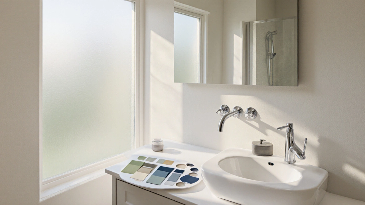
Before you buy paint, test a sample on the wall and view it at different times of day. If the hue shifts dramatically, you may need a more neutral base.
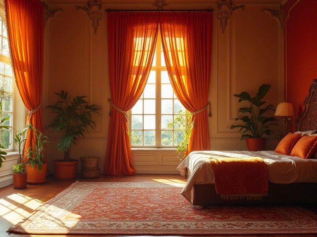
Size Matters: Light vs. Dark Hues
Small bathrooms benefit from light, reflective colors that make walls recede. Darker shades can make a compact room feel even tighter unless you balance them with ample lighting and reflective surfaces.
| Aspect | Light Colors | Dark Colors |
|---|---|---|
| Perceived Space | Enlarges, opens up | Cozy, can shrink |
| Maintenance Feel | Fresh, clean look | Elegant, hides minor stains |
| Lighting Requirement | Moderate | Higher (more lamps or windows) |
For a bathroom under 5 sq ft, consider off‑white, pale gray, or soft pastel tones. If you love drama, a navy accent wall paired with light vanity cabinets can achieve a balanced effect.
Matching Color to Style
Every interior style leans toward certain palettes:
- Modern minimalist: muted greys, crisp whites, and matte black accents.
- Scandinavian: cool blues, sage green, and warm wood tones.
- Farmhouse: warm creams, soft yellows, and barn‑red accents.
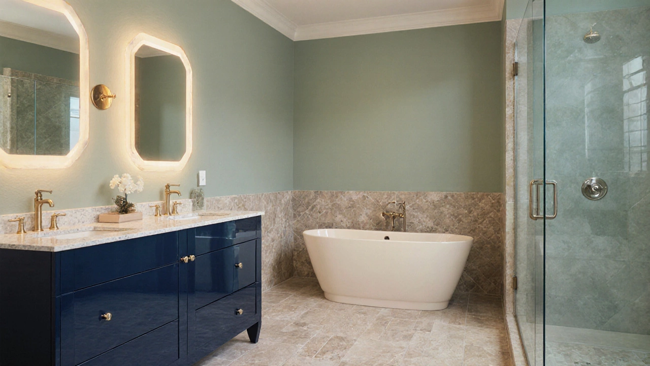
- Luxury spa: muted teal, stone‑like taupe, and brushed gold fixtures.
When the style is set, pick a accent wall a single wall painted a contrasting hue to add personality without overwhelming the room.
Top Flattering Colors for 2024‑2025
Design magazines and trade shows have highlighted a handful of shades that work on a wide range of bathrooms:
- Soft Sage Green - brings a hint of nature, pairs well with wood and stone.
- Warm Greige - a blend of gray and beige; it’s a neutral that feels upscale.
- Dusty Navy - adds depth; best used on a single wall or in smaller vanity cabinets.
- Cool Misty Blue - evokes water, perfect for airy, sun‑filled spaces.
- Creamy Ivory - timeless and bright; easy to match with chrome or brass fixtures.
Each of these colors works with both matte and glossy finishes, but the finish choice influences how the hue reads.
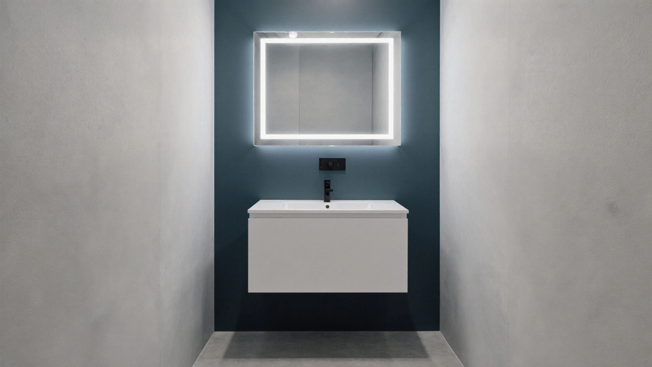
Finish Matters: Matte vs. Glossy
Matte finish a low‑sheen paint that hides imperfections is forgiving on walls with minor bumps. It also softens bright colors, making them feel more muted.
Glossy finish a high‑sheen paint that reflects light amplifies color vibrancy and can make a small space appear larger due to reflected light. However, it shows smudges more easily.
Mixing finishes-matte on larger surfaces and glossy on trim or a small accent panel-creates visual interest while hiding flaws where needed.
Quick Checklist for a Flattering Bathroom Color
- Identify dominant light source (natural vs. artificial) and test paint under both.
- Measure the bathroom; choose light tones for < 8 sq ft, darker tones for larger spaces.
- Select a style‑appropriate hue from the 2024‑2025 trend list.
- Decide on finish: matte for subtlety, glossy for drama.
- Plan an accent wall or cabinetry splash if you want a pop without full‑room commitment.
- Buy small sample pots; apply to a 12‑in‑square area and live with it for 48 hours.
Common Pitfalls to Avoid
Even seasoned homeowners slip up. Here are the most frequent mistakes and how to fix them:
- Choosing a color that matches the tile exactly. The room can look flat. Add a contrasting trim or a different matte/gloss level.
- Ignoring the undertone of existing fixtures. Brass hardware pairs well with warm tones; chrome looks sharper with cool shades.
- Applying dark paint on a low‑ceiling bathroom. Counter with a large mirror to bounce light.
- Skipping the test patch. Trends look different under bathroom LEDs; always sample first.
Frequently Asked Questions
Can I use the same color on walls and floor tiles?
It’s possible, but it can make the space feel monolithic. If you love the hue, use a lighter tone on the walls and a slightly darker, textured tile on the floor for depth.
Is bright white still a good bathroom color in 2025?
Yes, but modern whites now carry subtle undertones-warm ivory or cool greige-that keep the look from feeling sterile.
How many coats of paint do I need for a bathroom?
Two coats are standard. If you’re covering a darker color with a light one, a primer followed by two topcoats ensures even coverage.
Do matte finishes show water spots?
Matte paint resists spotting better than glossy because it doesn’t reflect light directly. Still, wipe down with a soft cloth after showers to keep it looking fresh.
What’s the best way to choose a flattering color if I have mixed lighting?
Start with a neutral base-soft greige or warm ivory-that works under both warm and cool light. Add a bolder accent (e.g., navy or sage) on a single wall where the light is consistent.