Ever walked into a room and felt instantly cozy or surprisingly tense? Curtain color might be the culprit. This stuff has real power—scientists even say that certain shades can mess with your mood or help you relax. The wrong color can shrink a room or make it feel cold, while the right one does the opposite.
So, start by grabbing a few things from your space. Your sofa, a throw pillow, maybe even a weird lamp you love. Hold them up near the window and picture a curtain color nearby. Does it calm you down, or does it make you want to bolt? It's not always about matching—sometimes it’s better to shake things up and go for bold and unexpected. The trick is to know why you’re picking the shade, and what it’s secretly doing to your vibe at home.
- Why Curtain Color Matters More Than You Think
- Match, Contrast, or Pop? Getting the Right Look
- Room Size, Lighting, and Window Direction
- Favorite Color Combos That Actually Work
- Easy Mistakes to Dodge (And Quick Fixes)
Why Curtain Color Matters More Than You Think
It’s wild how much of a difference curtain color makes. Yeah, they’re just fabric hanging over glass, but get this wrong and your whole room feels off. According to environmental psychology studies, the colors you see every day can actually boost or tank your mood. Ever notice how doctors’ offices use light blues and greens? That’s not random. They chill people out. Use that trick at home if you want a space to feel calm and open. Go too dark in a tiny bedroom, though, and you’ll end up with a cave vibe that’s hard to shake.
There’s another layer too: light itself. Curtains interact with sunlight way more than you’d think—certain colors bounce light around and make your space look bigger. Others suck up light and shrink everything. That’s why pale curtains are a go-to for small rooms with not much natural light, while deep shades can turn a sunny living room into a cozy den.
Think about your actual stuff: the couch, the rug, art on the wall. A curtain color should support the look you already have, or take it up a notch. Ever seen bright yellow curtains in a neutral room? They’ll pull focus instantly. That’s awesome if you love a pop, but a pain if you’re after a calm vibe. If you want the window to stand out, contrast; if you want it to blend, match or pick a shade just lighter or darker than your walls. Either way, curtain color isn't just an afterthought. It sets the whole mood.
- If you notice a room feels off, look at your window coverings first—it’s often the fastest, cheapest fix.
- Colors like blue, green, or soft gray can lower stress levels. Bold reds and oranges bring energy (sometimes too much for a bedroom).
- Even white comes in loads of undertones, so test before you buy.
Match, Contrast, or Pop? Getting the Right Look
If you’re stuck on curtain color options, don’t just reach for something that’s close enough. You've got three main paths: matching, contrasting, or going for a pop of color. Each one changes the whole personality of your space, so let’s break them down.
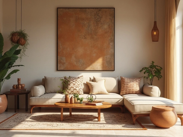
Matching is the safe zone. If your walls, sofa, or bedding are already bold, pulling one of those shades into your curtains makes the room feel calm and a bit more put together. For example, in living rooms filled with neutrals, tan or soft grey curtains basically melt into the background. The cool part? This trick makes rooms look bigger since there are no hard lines breaking up the space.
Contrast, on the other hand, is where things get interesting. If your walls are light, try navy or deep hunter green curtains. This gives you a frame for your windows and adds visual depth. Designers use this move to create focus and break up a sea of bland color. Just try to echo your curtain color somewhere else—like a pillow or a rug—so things look intentional instead of random.
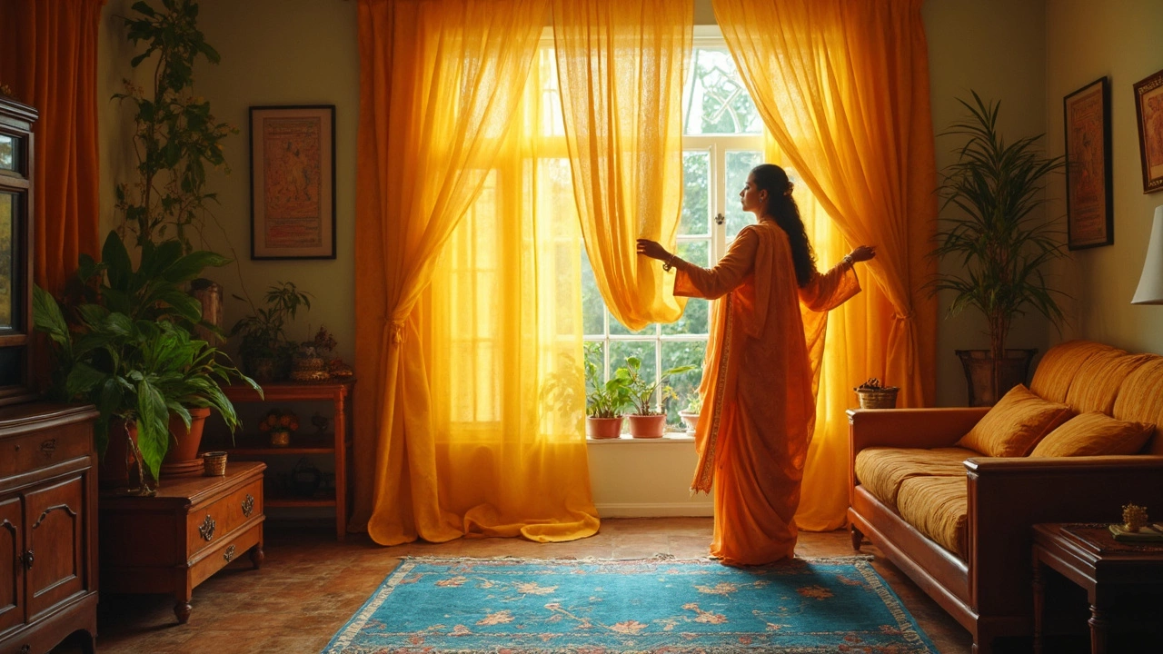
Popping with color is for you if you like a little edge or want a room to feel lively. Think yellow curtains in a white kitchen, or bold teal in a grey bedroom. People actually recall rooms with pop colors better, according to a University of Texas study—seriously, it’s good for both energy and memory. Pop colors also work in places you want excitement, not sleep—like home offices or creative studios.
- Matching: Stick with tones that already exist in your room, especially if you want a calm feel.
- Contrasting: Choose a color a few shades darker or on the opposite side of the color wheel for drama.
- Pop: One loud color, used once, makes a statement—just keep the rest simple so it doesn’t get chaotic.
Whatever you do, grab a fabric swatch or hold up a T-shirt in your favorite shades next to your window. Don’t rely on how things look on your phone or in store lighting—at home, colors can change fast with shifts in sunlight and lamps.
Room Size, Lighting, and Window Direction
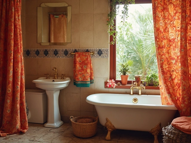
Let’s get practical for a second. You can’t just pick a curtain color based on what looks good in the store. The lighting in your actual space flips the script. North-facing rooms get cooler, bluish light all day, which makes colors look less warm—so yellow or cream curtains can help balance things out. South-facing windows soak up sunlight, so you can get away with bolder shades without making the place look like a dark cave.
Your room’s size matters, too. Dark curtains in a small space can swallow up the daylight, and suddenly your cozy den turns into a bunker. Lighter shades bounce more light around and can literally make four walls feel bigger. For big rooms that feel kind of empty, go the other way—a deeper tone or a bold print pulls the walls in.
Let’s break it down with a simple table:
| Room & Window Type | Best Curtain Color Choices | What Happens |
|---|---|---|
| Small, North-facing | Light warm tones (beige, pale yellow, soft peach) | Makes the space brighter and less chilly |
| Large, South-facing | Dark rich tones (navy, charcoal, deep green) | Adds coziness and controls harsh sunlight |
| Tiny with little daylight | Whites, pastels, light gray | Feels open and lifts your mood |
| Wide rooms with lots of windows | Bolder or patterned curtains | Helps anchor the space so it doesn’t seem empty |
If you’re not sure, here’s a quick tip: test curtain samples during different times of day. Morning and evening light change things up fast. Hold up your fabric by the window and see if you like it under real conditions—not just in the store’s weird lighting. You’ll dodge loads of regret this way.
Favorite Color Combos That Actually Work
Picking curtain colors isn’t rocket science, but having a few go-to combos in your back pocket makes a world of difference. Designers keep using these combos because they just work, no matter what trends are floating around TikTok or Pinterest.
- Neutral with Neutrals: White, beige, light gray, or taupe curtains basically go with anything. They won’t fight your furniture or clash with wall colors. If you’ve got a room packed with color or bold art, keep your curtains simple so nothing goes overboard.
- Deep Blues with Light Walls: Navy or denim blues look great against soft white, light gray, or pale blue walls. This adds a bit of drama but stays chill and cozy at the same time.
- Earthy Greens and Tans: Olive or sage curtains work with tan, cream, or even brick-red wall colors. This combo makes stuff feel grounded and brings a bit of the outside in—plants love the company, too.
- Soft Pinks and Charcoal: Here’s a surprise. Pastel or blush pink with dark gray walls actually looks really grown-up and modern—not little-kid at all.
- Mustard Yellow and Navy: This one’s big in living rooms. Mustard yellow curtains add energy, but navy furniture or rugs keep it balanced—no wild chaos.
A 2023 survey on curtain color preferences found that over 60% of people who recently picked new curtains went for neutral shades, while 25% went for blue or green combos, and only 15% chose bold hits like mustard or bright pink.
| Color Combo | Best Room Type | Perceived Effect |
|---|---|---|
| White & Beige | Bedrooms, Living Rooms | Airy, calming |
| Deep Blue & Light Gray | Offices, Living Rooms | Focused, stylish |
| Olive & Tan | Dining Rooms, Kitchens | Homey, soothing |
| Blush Pink & Charcoal | Bedrooms | Modern, soft |
| Mustard & Navy | Living Rooms | Cheerful, balanced |
Not sure which way to go? Snag a few cheap fabric samples and tape them on the wall by your window. Look at them during the brightest part of the day and again at night—sometimes a color that’s perfect at noon looks weird under lamp light. No shame in playing it safe, but if you want to try something trending, these combos won’t tank your style.

Easy Mistakes to Dodge (And Quick Fixes)
Picking curtain color can go sideways fast—people mess it up all the time. The biggest headache? Ignoring the rest of the room. You can’t slap any color up and hope for the best. If your walls or main furniture are already bold, strong colored curtains might just feel like too much.
One of the most common flubs is going with a trendy color just because it’s popular. Ask yourself: Do you actually like it, or are you being swayed by ads and Pinterest? Interior designer Sarah Sherman Samuel puts it plainly:
“Curtains should work with your existing palette, not against it. Start with what you love—and what you already have.”
Another mistake: forgetting about sunlight. Dark curtains in a tiny, north-facing room can zap all the natural light. On the other hand, super light colors in a sunny spot might end up looking washed out or show every stain.
Let’s be real, size matters. Short curtains or the wrong width are easy mistakes that throw off the balance of the whole room. Always measure your windows and add a bit more—the classic rule is to go wider and let them graze (or slightly puddle) the floor.
- Curtain color clashes with big pieces (sofa, rug, walls)
- Picking colors just because they trend
- Disregarding how much sunlight your room actually gets
- Forgetting to measure correctly before buying
- Ignoring care instructions—some colors fade faster than others
Check out this quick cheat sheet based on home decor studies from the last few years:
| Mistake | Impact | Easy Fix |
|---|---|---|
| Color Clash | Makes space feel hectic | Pick from the room’s two main shades |
| Color Too Dark | Room feels smaller, gloomy | Try lighter neutrals—white, beige, light gray |
| Wrong Size | Window looks awkward | Measure width, let curtains touch the floor |
| Trendy Color Only | Tiresome fast | Stick with what you genuinely enjoy |
| Not Checking Fabric in Natural Light | Color looks off | Test fabric swatch by the window at different times |
Little changes can save the day. Sometimes all you need is a swap to a classic shade, or adding a lining to tone down a too-bright curtain. Buy just one panel to test at home if you’re on the fence—that one move saves so much hassle.