Here’s the unglamorous truth: white still rules the living room. Not because people lack imagination, but because white and off-white are the most forgiving, easiest to style, and the safest bet if you’re renting, staging to sell, or juggling kids and crumb trails. The tricky part isn’t the answer-it’s choosing the right white. Undertones, light, sheen, even your floors change the look. I learned this the hard way in Sydney, where our west-facing place floods with late arvo sun. The wrong white turned our lounge into a glare box; the right warm neutral fixed it overnight and survived Cormac’s chocolate hands.
TL;DR / Key Takeaways
- The most common living room color is white or off-white. Brands and design surveys have shown neutrals dominate year after year.
- Pick your white by light: north-facing rooms favor warmer whites; south-facing rooms can handle cooler, crisper whites.
- Use LRV (light reflectance value) as a guide: 60-85 for most living rooms; low-light rooms benefit from higher LRV.
- Sheen matters: matte/eggshell hides flaws; satin is more wipeable (handy with kids and pets).
- Test big samples on two walls and check morning, noon, and night-undertones shift with light and furnishings.
What’s the Most Common Color-and Why It Wins
Short answer: white and off-white. That includes clean whites, warm whites (with a hint of yellow/red), and soft neutrals like ivory, cream, and greige. Paint makers and retail chains repeatedly report that their top-selling interior colors are whites and warm neutrals. Industry snapshots-from Dulux Australia retail sales to Sherwin-Williams and PPG color insights-tell the same story: most people want something that looks clean, goes with anything, and won’t scare buyers or landlords.
Design surveys back it up. Houzz AU renovation reports and real estate styling notes in Australia show living rooms lean neutral, especially when people plan to sell. Zillow’s U.S. color analyses have shifted over the years, but the consistent message is that light neutrals help homes look bigger, brighter, and more move-in ready. Whether you’re in an inner-city apartment in Sydney or a suburban family home, a soft white baseline makes furniture, rugs, and art do the talking.
Why it works so well:
- It’s flexible: good with timber floors, concrete, carpet, leather, linen-anything.
- It’s light-boosting: high-LRV whites bounce sunlight around, which helps dark rooms and short winter days.
- It’s low-risk: neutral walls don’t date quickly and won’t fight your sofa.
- It’s resale-friendly: agents and stylists love a fresh, neutral living room.
But “white” isn’t one color. Undertones shift the mood: cool whites can read blue next to south light and grey furniture; warm whites can look creamy next to yellow timber floors. That’s why choosing the right white matters more than the bucket label.
How to Choose Your Living Room White (Or Neutral): A Simple 6-Step Plan
-
Map the light (direction and intensity). Stand in your living room at 8am, noon, and 4pm and note the vibe.
- North-facing (southern hemisphere) = cooler light: choose warmer whites and warm neutrals to avoid a chilly look.
- South-facing = warmer, steadier light: crisper whites can look fresh without going stark.
- East-facing = bright in the morning, cooler later: balanced or slightly warm whites work well.
- West-facing = warm afternoon sun: avoid very yellow whites that can look too creamy at sunset.
-
Use LRV as a filter. Light Reflectance Value runs 0-100. The higher, the more light a color reflects.
- Low-light rooms: LRV 70-85. You want bounce without glare.
- Bright, glare-prone rooms: LRV 60-75. Slightly lower LRV reduces harshness.
- Open-plan with mixed light: LRV 65-80. Safer mid-high range.
-
Check undertones against fixed finishes. Put swatches next to your floors, benchtops, tiles, and big furniture.
- Yellow or orange timber floors: lean into soft warm whites or greiges with gentle warmth. Pure cool whites can look icy.
- Cool grey tiles or concrete: a neutral or slightly warm white stops the room feeling clinical.
- Beige carpet: choose a warm white that doesn’t go peach next to it.
-
Pick a sheen that fits your life.
- Matte/Flat: best at hiding wall flaws; shows marks; modern look.
- Eggshell/Low Sheen: sweet spot for most living rooms; wipes better; soft look.
- Satin: more durable and scrubbable; a touch more reflection.
With kids or pets, eggshell/low sheen is a sanity saver. In our place, a durable low sheen has survived Cormac’s art projects.
-
Test big-A4 or larger. Paint two coats on sample boards or directly on walls.
- Place one swatch on the darkest wall and one on the brightest.
- Look at them morning, noon, and night.
- Hold next to trim and ceiling; mismatched whites can make walls look dirty.
-
Lock in trim and ceiling last. Two easy approaches:
- Same white on walls and trim, different sheen (eggshell walls, semi-gloss trim) for a soft modern look.
- Walls a warm white, trim a cleaner, slightly brighter white for a crisp frame.
Rule of thumb: If you can’t tell whether a white is warm or cool when taped to your floor, it’s probably not the right white for your home. Whites should harmonise with what’s already there.

Real-World Palettes and Use-Cases
If you want more than just “white,” here are living-room-friendly combinations that still keep things calm and classic.
-
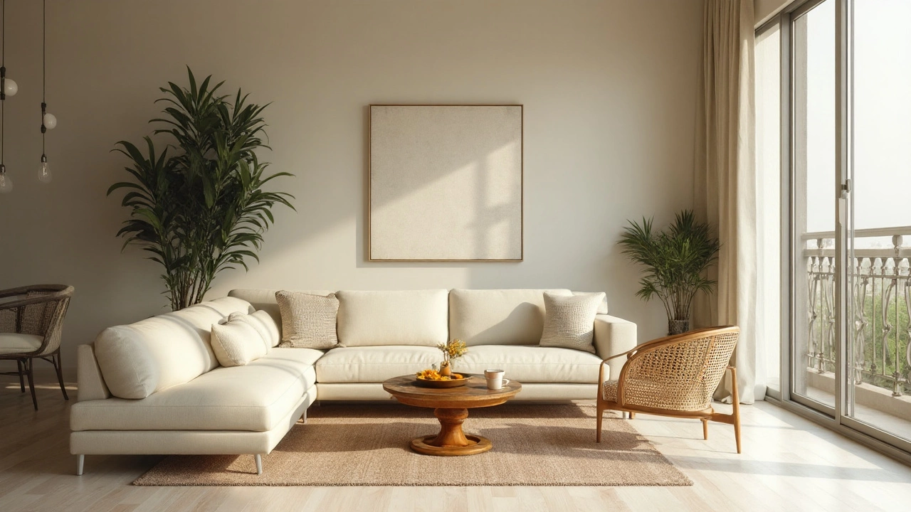
Modern Minimal
- Walls: neutral white (LRV ~80), balanced undertone.
- Trim: bright white, semi-gloss.
- Accents: black metal, grey stone, warm timber to stop it feeling clinical.
- Works with: polished concrete or pale oak floors.
-
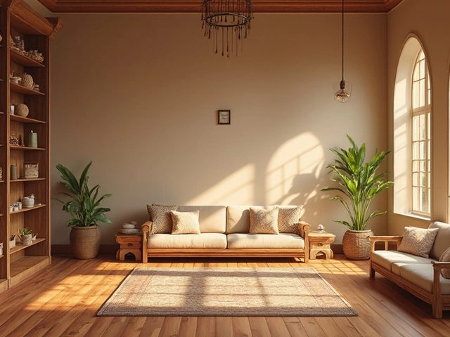
Coastal Calm (great in Sydney’s light)
- Walls: warm white with a whisper of beige (LRV 75-80).
- Trim: soft white, same family but slightly cleaner.
- Accents: sand, sea-glass green, muted navy, woven textures.
- Works with: rattan, linen, whitewashed oak.
-
Scandi Soft
- Walls: neutral-to-warm white (LRV ~78) to balance grey textiles.
- Trim: same color in gloss for subtle depth.
- Accents: pale timber, charcoal, blush, sage.
- Works with: oak floors, simple lines, big leafy plants.
-
Transitional (mix old and new)
- Walls: creamy white or light greige (LRV 65-75).
- Trim: cleaner white for contrast on profiles and mouldings.
- Accents: brass, navy, patterned rugs.
- Works with: heritage features, warmer floors.
-
Family-Proof Neutral
- Walls: soft greige (LRV 60-70) that hides scuffs better than bright white.
- Trim: tough semi-gloss in a brighter white to take the hits.
- Accents: denim blues, tan leather, washable slipcovers.
- Works with: high-traffic spaces, kids, pets.
If you prefer subtle color: try a very pale color with a high LRV (think a whisper of sage, blue-grey, or clay). You still get that big, bright feel, but with personality-nice in coastal or bush-adjacent homes where nature is the star.
| Color Family | Typical LRV Range | Best For | Common Undertone Pitfalls | Pairs Well With |
|---|---|---|---|---|
| Clean/Cool White | 80-90 | South-facing rooms, modern minimal spaces | Can read blue/clinical next to grey floors or winter light | Black accents, cool stone, crisp trims |
| Warm White | 75-85 | North-facing rooms, spaces with cool floors | Can skew yellow in afternoon sun or with orange-toned timber | Beige/greige textiles, warm metals, oak |
| Neutral White | 75-85 | Mixed light, open-plan living | Can look flat if everything else is neutral | Textured rugs, natural fibers, layered lighting |
| Light Greige | 60-75 | Family rooms needing durability and warmth | May read pink/purple next to certain carpets | Tan leather, navy, walnut, matte black |
| Very Pale Color (sage, blue-grey) | 65-80 | Adding personality without heaviness | Can turn childish if too saturated | Natural timber, white trim, soft black accents |
Cheat Sheets, Rules of Thumb, and a Quick Decision Tree
Use these to shorten the decision cycle from weeks to a weekend.
Quick rules
- Not sure? Start with neutral or warm white, LRV 75-80, eggshell finish.
- North-facing (cool light): choose warm whites or light greige.
- South-facing (warm light): neutral or cool whites look fresh.
- West-facing (afternoon glare): avoid very high LRV; look for balanced or soft warm whites.
- East-facing: balanced white that doesn’t go grey in the afternoon.
- Grey floors or cool stone: avoid icy whites that double down on blue.
- Timber with orange tones: avoid whites that already lean yellow.
- Small rooms: keep contrast low (similar walls, trim, and ceiling) to make edges blur and space feel bigger.
Decision tree
- Your room looks cold most of the day → try a warm white (hint of beige/cream), LRV 75-80.
- Your room feels harsh/bright → choose a slightly lower LRV neutral (65-75) to cut glare.
- Your sofa and floors are cool/grey → pick a neutral-to-warm white so the room doesn’t go clinical.
- Your floors are warm/orange → pick a balanced white that doesn’t amplify yellow; sample carefully at sunset.
- You need ultra-durable walls → use a washable low sheen or satin; avoid flat matte unless your walls are flawless.
Sample like a pro
- Use at least three whites: a warm, a neutral, a cool. You need comparison to see undertones.
- Paint two coats on A4/A3 boards; move them around.
- Judge at different times-and with lights on at night.
- Place swatches behind your TV, near the sofa, and across from windows; glare can hide undertones.
Sheen cheat
- Walls: eggshell/low sheen for most homes; satin if you expect scrubbing.
- Trim/doors: semi-gloss; it takes knocks and cleans up easily.
- Ceiling: flat to hide flaws; use the wall color lightened if you want a lifted feel.
Mini-FAQ, Fixes, and Next Steps
Is white boring? Not when you layer texture and contrast. Think linen, loop-pile rugs, timber, metal, and plants. White is the backdrop; the life comes from what you put on it.
Should I paint the ceiling the same color as the walls? You can. Same color, different sheen, gives a seamless, higher feel. If your ceiling is low, keeping walls and ceiling close in tone blurs the edge and adds height.
What if my white looks blue? That’s a cool undertone showing up in your light. Switch to a warmer white or add warm lampshades and timber. If it’s the paint, choose the next warmer sample with a similar LRV.
What if my white looks too yellow? Sunset or warm bulbs can push it yellow. Try a more neutral white. Swapping bulbs to 3000-3500K also helps without repainting.
Will grey look dated? Greys had a huge run. Today, softer greiges feel warmer and more liveable. If you love grey, keep it light and mix with warm textures.
How many samples do I need? Three to five. One warm, one neutral, one cool, plus a wild card. That contrast helps your eye calibrate.
Best white for selling a home? A clean, neutral white with LRV around 78 in low sheen. Fresh, bright, zero drama-agents can style it any way.
Best white for kids and pets? A soft greige or warm white in a washable finish. Not as unforgiving as bright white, still feels light.
Open-plan living/dining/kitchen-one color or many? Usually one base color, then change depth by room if needed (e.g., same family, one step darker for the TV nook). Keep trims consistent to tie it together.
Rental-friendly move? If you can’t paint, use large-scale textiles (curtains, rugs, throws) to set the palette. Light, neutral walls will play along.
Eco/health concerns? Choose low- or zero-VOC paint. Most major brands offer them now; they smell less and cure cleaner.
Troubleshooting
- Looks patchy or streaky: You need a primer or a second/third coat. Cheap rollers also cause shadowing.
- Too much glare: Drop the sheen or the LRV; add sheers to soften daylight.
- Walls look dirty next to the trim: Your trim is probably a cleaner white than your walls. Either match them or go for deliberate contrast.
- Color shifts from room to room: Different bulbs. Standardise to 3000-3500K warm/neutral LEDs for consistency.
- Room still feels small: Reduce contrast-match doors and trims to wall color, use larger rugs, keep furniture legs light and lifted.
Next steps for different goals
- Quick weekend refresh: Neutral/warm white, LRV ~78, eggshell. Same color on trims in semi-gloss for speed. One primer, two coats.
- Staging to sell: Crisp, neutral white throughout, consistent trims, minimal color breaks. Let the styling do the work.
- Young family: Soft greige, washable finish, ceiling flat, trim semi-gloss. Add color through art and cushions you can swap.
- Bold personality, cautious walls: Keep walls light; go big on a rug, curtains, or a deep-colored media unit.
Bottom line: white and off-white dominate because they make life easier and rooms brighter. Pick the right undertone and sheen for your light, sample generously, and let your furniture and textures carry the character. That’s how you get a living room that looks good on day one and still feels right five years from now-tested in the full chaos of Sydney afternoons and snack time.