Imagine standing in your living room, hammer in hand, staring at that perfect framed poster you’ve been meaning to hang. For a moment, the task feels bigger than it should. Where exactly do you put the nail? Eye-level, right? But eye-level for who—Shaquille O’Neal or your average ten-year-old? If you’ve ever found yourself questioning how high you should hang a picture, you’re not alone. There’s a real answer to this, and designers from Stockholm to Sydney agree on a surprising magic number. This isn’t just random trivia—it’s one of those tiny life hacks that make a space feel finished. Ready to pull it all together? Let’s find out what really works.
What is the "Magic Number" for Hanging Pictures?
Here’s the not-so-secret, secret: the magic number is 57 inches. That’s the sweet spot for the center of your picture—the exact height where the middle of your artwork should sit above the floor. Sounds weirdly specific, but it didn’t just pop up overnight. Art galleries and museums have been following the 57-inch rule for decades, and it’s seeped into modern interior design with good reason.
Why 57 inches? It matches the average adult eye level in North America. If you’re walking around a gallery, curators want you to see each piece with minimum neck strain and maximum focus. Artwork looks best when people can engage with it naturally without having to tilt their head way up or down. So, designers borrowed this idea. The 'magic number' seems to work for most rooms and most folks. Of course, there are quirks to every rule, but you’d be shocked how many times following 57 inches just makes the art look right.
Take this example: My buddy Roger insisted on hanging his new print 70 inches up because he “didn’t want it at kids’ height.” The wall ended up looking off, and anyone sitting on his couch had to crank their neck to see the whole thing. When we re-hung it centered at 57 inches, the whole living room vibe changed. It looked like the piece belonged there, and the space finally felt finished. Try it on any wall—odds are, you’ll feel the same effect.
Now, for the math: To use the magic number, find the total height of your frame. Divide it in half to get the center point. Next, measure and mark 57 inches from your floor up the wall. That point is where the center of the frame should hit. Don’t forget to account for the distance from the picture’s hanging hardware to the top of the frame. You’ll want your hook or nail slightly higher to keep the art’s midpoint at 57 inches. It’s a small extra step, but it makes all the difference.
You might wonder, does this work with every type of art? For single large prints, the 57-inch rule is a safe bet. With groupings (think photo walls or triptychs), try to keep the center of the grouping—imaginary or otherwise—at 57 inches. Suddenly, your gallery wall feels cohesive, not like a scatter-shot of random moments. Art pros think in these terms because the eye likes order. Even wild, creative clusters look more deliberate with this anchor point.
If you’ve got kids, high ceilings, or you’re styling a hallway, should you throw out the rule? Not quite. Instead, bend it. In extra-tall spaces, art that hugs only the upper air looks adrift, so you may want to edge up to 60 or 62 inches. Kid-friendly spaces? Drop the art a little so smaller eyes can appreciate it. The 57-inch sweet spot works for average-sized rooms, but tweaking for your crowd makes all the difference. There’s artistry—and a pinch of common sense—to it.
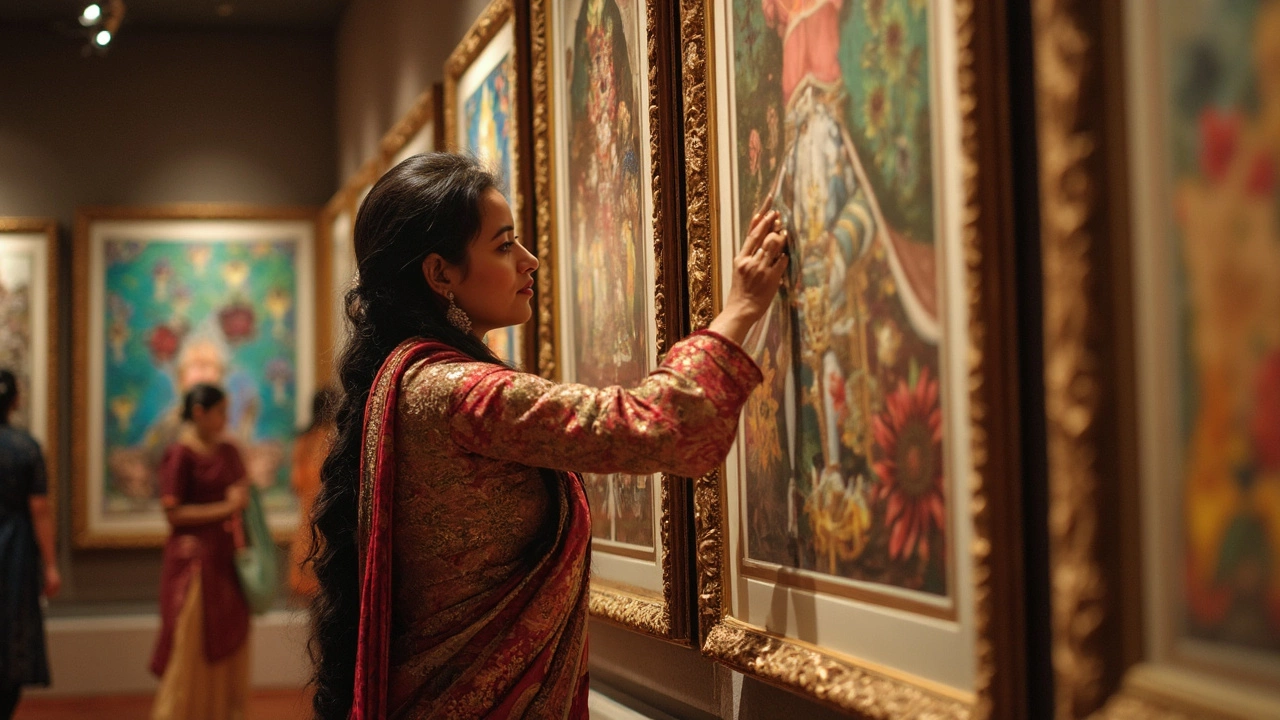
There’s real history to this, too. Art museums in the early 20th century realized that mass crowds enjoyed paintings more when the works sat at consistent heights. The Louvre and the Met still use this exact method. Once the big museum folks got it right, decorators followed. Funny how a simple number can connect your living room to the world’s greatest galleries.
Tips and Tricks for Hanging Like a Pro
So you know the magic number, but how do you make it all line up on your wall, in real life? Let’s be honest: bent nails, cracked plaster, and crooked frames happen to the best of us. There are a few pro moves that keep things smooth and stress-free.
- Use painters tape: This stuff is magic for avoiding extra holes. Make a paper or tape template of your frame’s size, stick it to the wall, and check how it feels at 57 inches center before hammering.
- Mark your wall: Once you get the center spot calculated, mark it lightly with a pencil. Then, flip your frame over and measure from the hanging wire or bracket to the top of your frame. Add this to your math. For instance, if this gap is 4 inches, hammer your nail 4 inches above your initial mark.
- Check with a level: There’s nothing weirder than a slightly slanted picture. Set a small bubble level on top before you call it done. Digital phone apps can work if you can’t find the old-school tool.
- Go for the right hardware: Don’t trust thumbtacks or tiny nails for anything bigger than a postcard. For heavier frames, use wall anchors. If you’re renting and can’t make big holes, look for stick-on or removable hooks designed for picture hanging.
- Step back and judge: Sometimes, what looks good up close feels off from across the room. Before you commit to the final spot, step way back and get a feel for how it fits into the whole space. Daylight, wall color, and nearby furniture all influence how your art will pop.
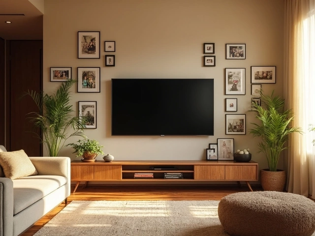
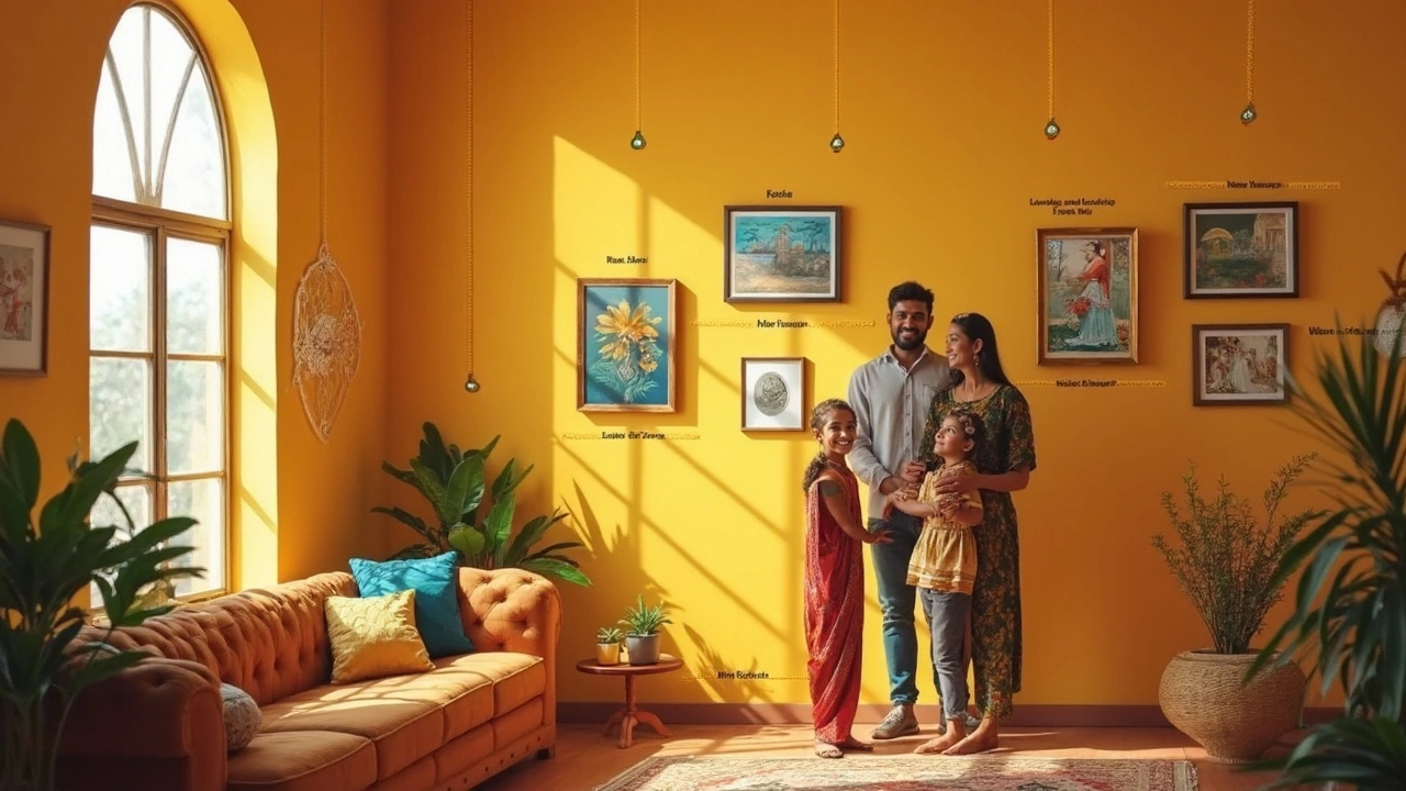
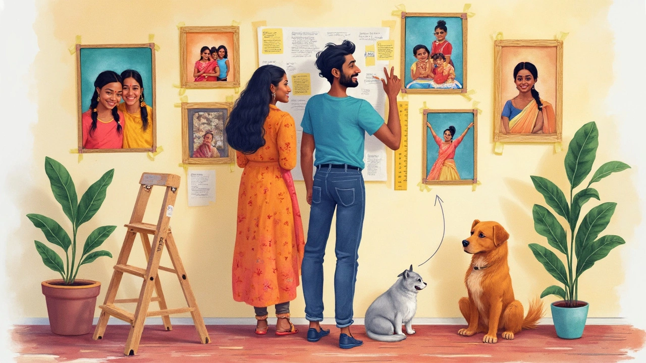
Hanging multiple pictures? Here’s where things get creative—and messy if you skip planning. Whether you’re building a salon wall of family photos or mixing frames in different shapes and sizes, order beats chaos. The magic number still matters. Imagine your collection as a single block, then aim the center of that block at 57 inches high.
To pull off a gallery wall, lay everything out on the floor first. Arrange to your heart’s content, then grab a quick snapshot. That photo will serve as your cheat sheet for putting pieces on the wall. Some designers even cut out paper replicas of each frame and tape them in place as a preview, making spacing and alignment a breeze.
Spacing is the unsung hero of a killer gallery wall. Too much gap and it’s a scattered mess; too close, and it feels jammed. About two inches between frames is usually a safe bet. For extra harmony with different frame sizes, align their centers—not tops or bottoms. The eye tracks things better that way.
Mirrors, wall sculptures, and even wall-mounted shelves can use the same trick. Just keep the main visual point—the heart of your installation—centered at the magic number. Suddenly, everything feels curated, not thrown together. Your home tells a story, instead of looking like a garage sale.
Failing your first try? That’s normal. Even professional installers shift things a few times to get it right. If you need to patch holes, lightweight wall filler (and a little leftover paint) covers your tracks like nothing happened. Don’t let a tiny mistake keep you from hanging art you love.
Common Mistakes and How to Avoid Them
You wouldn’t believe how many fantastic rooms get thrown off by tiny missteps in picture placement. Maybe you’ve moved into a place with random nail holes scattered across every wall. Maybe you’ve walked into a friend’s house and every frame is either tipping downhill or floating two feet above the couch. These errors are more common than they should be, but they’re easy to dodge once you know what to watch for.
The single most frequent mistake is hanging art too high. People have this strange instinct to put art way up close to the ceiling, maybe thinking it “fills the wall” better. The truth? Higher does not mean better. When pictures get hung above natural sight lines, they get ignored. Even though it might feel weird to hang art lower than you expected, trust the process—rooms look and feel better for it. That 57-inch center rule is your best friend.
Another classic blunder is not measuring at all. 'Eyeballing it' is fine for the rebellious types, but just a small mistake can mean the difference between art that stands out and art that disappears into the chaos. Grab a tape measure and a level, even if it makes you feel a bit like your fussy uncle building birdhouses in the garage.
Let’s talk proportions for a second. Putting a tiny 8x10 frame on a huge empty wall is going to look lost, while a massive portrait squeezed onto a narrow hallway cries out for help. When matching art to space, a good rule of thumb: fill about two-thirds to three-quarters of the wall width above furniture like couches or beds. It keeps things visually grounded and pleasing.
If your art seems to wander or tilt every few days, you might have picked the wrong hardware. Frames hung from a single nail are notorious for spinning sideways—especially if you have kids, pets, or a drafty window. Use two hooks spaced apart to keep heavy or longer frames from tilting. Some folks pop a little piece of sticky tack behind each lower corner of the frame to keep it from shifting over time. It’s a dirt-cheap, clever solution.
Ever see a beautiful painting obscured by a floor lamp or hidden behind tall plants? Consider the other elements in your room before hanging. Make sure nothing blocks the view. After all, you’re trying to show off the art, not hide it in a game of visual peek-a-boo.
If you’re using multiple pieces, another common error is sticking rigidly to perfect grids or spacing. Life—and rooms—aren’t always symmetrical, and forcing frames to march in a strict row can feel stiff. When in doubt, create a layout with an imaginary center line at the magic number and balance visual weight, not just height. Odd numbers of frames (three or five, rather than two or four) tend to look better—maybe it’s just human nature, but odd-grouped layouts are more pleasing to the eye.
Here’s an advanced move: lighting. If your art looks dull, think about adding a simple picture light or a nearby wall sconce. A little focused lighting can make even simple prints look like treasures. Good lighting brings out color, texture, and the stuff you love about the work. Even tiny lights on a gallery wall can cozy up a room immediately.
Not every piece needs a frame either. Sometimes, canvas prints, tapestries, or raw-edge photography look better without anything extra. The same 57-inch center trick keeps those more modern works looking intentional rather than random.
One last tip: trends change, but the fundamentals don’t. Some designers are now experimenting with ultra-low hangings (especially above beds) or mixing wall art with table-top decor. As long as you ground your groupings using the magic number, there’s room for play without ending up with a wall that feels silly or cluttered.
The magic number for hanging pictures isn’t just a trick—it’s a game changer. Use it, tweak it, and suddenly even the most stubborn blank wall feels like a gallery. Next time you have art to hang, remember: 57 inches, some tape, and a willingness to go lower than you think. Your home just leveled up in style.