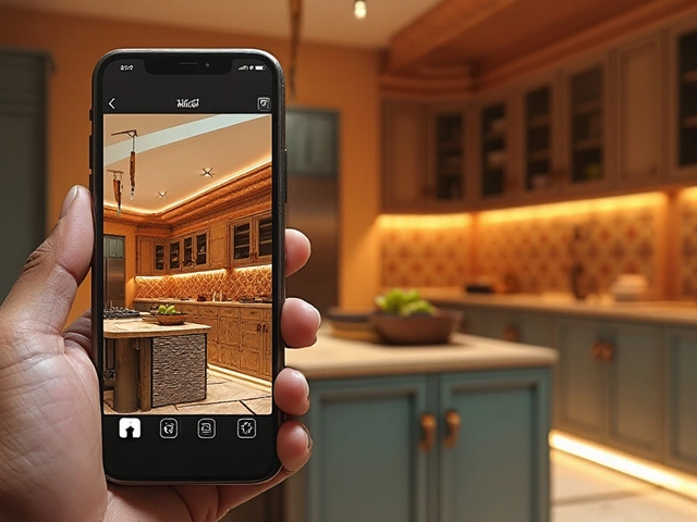
Kitchen Color Balance Calculator
Apply the 60-30-10 Rule to Your Kitchen
The 60-30-10 rule helps you create a harmonious kitchen design by allocating percentages to dominant, secondary, and accent colors. Calculate your ideal color distribution below.
Your Kitchen Color Allocation
Dominant Color (60%)
Secondary Color (30%)
Accent Color (10%)
How to use these results
1. Use the dominant color for walls, large cabinets, or flooring
2. Apply the secondary color to countertops, backsplash, or island cabinetry
3. Add the accent color through appliances, lighting, or small accessories
4. Remember: The 60-30-10 rule is a guide - slight adjustments are acceptable
When planning a kitchen, the 60-30-10 rule is a color‑balance guideline that suggests 60 % of a space be a dominant hue, 30 % a secondary shade, and 10 % an accent color helps you create a harmonious look without over‑thinking every paint chip.
Why the rule matters in a kitchen
The kitchen is the heart of a home, so it gets heavy traffic, bright light, and endless style experiments. A balanced palette prevents the room from feeling either too bland or overwhelmingly busy. By assigning percentages, you get a quick visual check: are you stacking too many bright tiles? Is the cabinetry overpowering the walls? The rule forces you to ask those questions early, saving money on re‑paints and remodels.
Breaking down the three parts
- 60 % - Dominant color: This is the base you’ll see the most. In kitchens it’s usually the wall paint, large cabinets, or floor covering.
- 30 % - Secondary color: This supports the dominant hue. Think of countertop material, backsplash tiles, or island cabinetry.
- 10 % - Accent color: The pop that adds personality - a bold appliance, pendant lights, bar stools, or an art piece.
Each layer should relate to the others, either through hue (same color family) or contrast (complementary shades). When the ratios feel off, the space either looks flat or chaotic.
How to choose the colors
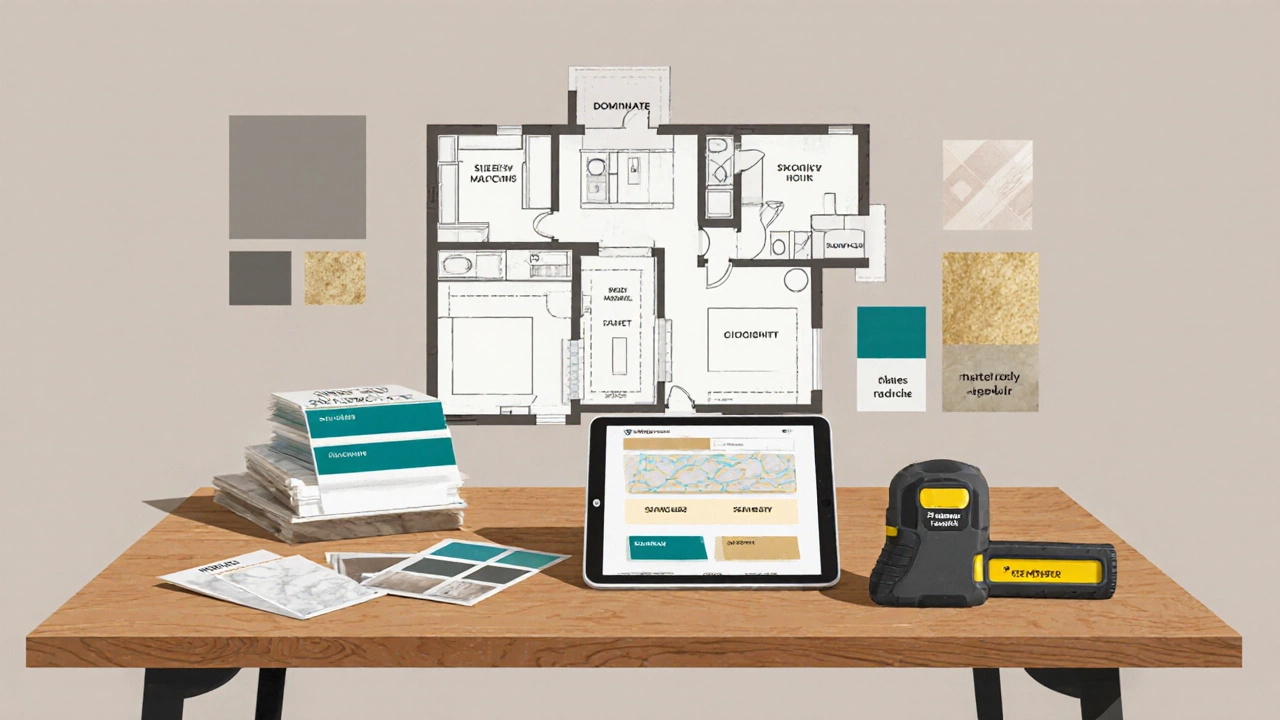
Start with a Kitchen design project brief that lists the function, lighting, and style you want. Then follow these steps:
- Identify the dominant hue. For most homes, a neutral (soft gray, warm white, or muted greige) works well because it lets appliances and accessories shine.
- Select a secondary shade that complements the dominant tone. If you chose a warm gray wall, a cool marble countertop offers subtle contrast without clashing.
- Pick an accent color that energises the room. Bold reds, teal, or mustard work great for small accessories because they draw the eye without overwhelming the space.
Use paint swatches, material samples, and digital mood boards to see the three colors together before committing.
Real‑world examples
Below are three kitchen makeovers that illustrate the rule in action. The numbers are approximate, based on surface area measurements.
| Style | Dominant (60 %) | Secondary (30 %) | Accent (10 %) |
|---|---|---|---|
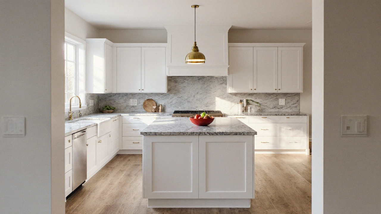
| Modern minimal | Matte white cabinets | Quartz light gray countertop | Brass pendant lights |
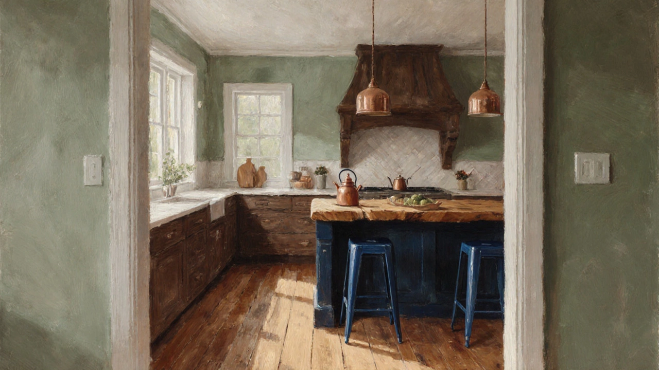
| Farmhouse | Soft sage walls | Butcher‑block island | Deep navy bar stools |
| Industrial | Charcoal concrete floor | Stainless steel appliances | Red‑oxide tile backsplash |
Notice how each kitchen respects the 60‑30‑10 split, yet the overall vibe differs because the color families change.
Common pitfalls and how to avoid them
- Choosing too many accent pieces. A single bold element works best. If you add a patterned rug, tone down the pendant lights.
- Ignoring natural light. A dark dominant color can make a small kitchen feel cramped. Test paint colors at different times of day.
- Letting appliances dictate color. While stainless steel is popular, you can still apply the rule by treating the metal as a neutral backdrop.
- Mixing too many hues. Stick to one color family for dominant and secondary tones; let the accent be the only outlier.
Pro tips for a flawless application
- Use a laser measure or floor‑plan software to calculate surface percentages before buying paint.
- When in doubt, start with 70‑25‑5; it’s easier to add accent later than remove it.
- Layer texture as well as color. A matte finish for the dominant area and a glossy finish for the accent creates visual depth.
- Consider the Cabinet finish material and sheen as part of the dominant percentage, not a separate category.
- Keep a sample board of all three colors side by side; stand it near your kitchen window for an accurate view.
Mini‑FAQ
Can the 60‑30‑10 rule work with dark kitchens?
Yes. Use a dark hue for the dominant 60 % (e.g., navy cabinets), pair it with a lighter secondary material like marble, and choose a bright accent such as copper hardware.
What if my kitchen layout is open‑plan?
Treat the entire open space as one canvas. The dominant color can flow from the kitchen onto the adjoining dining area, keeping the visual ratio consistent.
Do I need to stick to exact percentages?
Exact numbers are a guide, not a law. Aim for the 60‑30‑10 feel; slight adjustments (e.g., 55‑35‑10) are fine if the space looks balanced.
How does lighting affect the rule?
Natural light can brighten a dark dominant shade, while warm pendant lighting can soften a cool secondary tone. Always test colors under your kitchen’s typical lighting.
Can I apply the rule to textures instead of colors?
Absolutely. Think of the dominant texture as smooth cabinetry, secondary as a rough brick backsplash, and accent as a glossy tile strip.
Next steps for your kitchen project
1. Sketch your floor plan and measure each surface. 2. Choose a neutral dominant color and order a small test can. 3. Pick a secondary material that complements the paint. 4. Add one accent piece and evaluate the overall feel. 5. Stick to the 60‑30‑10 ratios as you shop for cabinets, countertops, and accessories.
Follow these steps and you’ll end up with a kitchen that feels purposeful, stylish, and timeless.