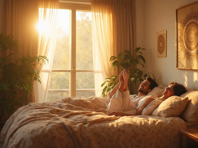
We've all been there—catching the perfect picture at the perfect angle, just to hang it completely wrong at home. So, what are some spots you should absolutely avoid for hanging your prized pieces? First off, direct sunlight is a no-go. It might make your room look bright and cheerful, but over time, that lovely picture is going to fade faster than a selfie from last season.
Think about humidity before you hang anything in your bathroom or above a sink. The steam and moisture might warp the frame or even ruin the print itself. Not a good look for anyone.
And while you're at it, be careful not to jam your art into cluttered corners or narrow hallways. These spots can make your masterpiece look more like an afterthought than the focal point it deserves to be. Plus, you'll probably miss out on the appreciation factor when people are more focused on not bumping into something.
- Direct Sunlight Dangers
- Steamy Situations to Avoid
- Cluttered Corners Aren't Cool
- Beware of Busy Walls
- Height: Too High or Too Low
- Room for Viewing and Movement
Direct Sunlight Dangers
Ever noticed how your favorite magazine cover from last year looks pretty washed out after some time in the sun? That’s exactly what happens to your wall art when it’s exposed to direct sunlight. While natural light can make a room look more inviting, it’s a bit like leaving your photos in a time-traveling machine that only goes forward to the 'faded and forgotten' era.
The main culprit here is UV rays. They’re sneaky and can break down the chemical bonds in dyes and inks, causing colors to fade. It doesn’t matter if it’s summer sun or winter rays; they’re always up there, working tirelessly to zap life out of your favorite art pieces.
- Use UV-protective glass for frames. This can give your art an extra layer of defense against those pesky rays.
- Opt for window treatments like blinds or curtains that shield your interiors during peak sunlight hours.
- Consider moving your pictures to a wall that isn’t blasted with sunlight throughout the day.
If going all high-tech is your thing, think about replacing your regular pane windows with UV-blocking ones. They might cost a little upfront, but they’ll keep your entire room cooler and your artwork vibrant.
Now, if your mind is already rushing to consider layouts that’ll keep your art out of the sun, remember—it’s pretty simple to keep your decor intact with just a few tweaks. Keep the blinds drawn at peak sun times or rearrange your space so your art isn’t in the sunlight’s direct path. It’s a small step that ensures your walls remain equally fabulous over the years.
Steamy Situations to Avoid
Hanging pictures in humid areas can be a recipe for disaster. Places like bathrooms or above kitchen sinks might seem like a great idea for adding a little decor flair, but there's a catch. The excessive moisture in these spaces can cause all sorts of problems for your wall art.
First up, moisture can lead to mold growth, not just on the pictures themselves but also on the frames. Who wants that fuzzy green stuff creeping up their family photos or art prints? No thanks! Plus, if you've got wood or paper-based art, prolonged exposure to humidity can warp the material, making what was once a straight and steady canvas look more like a kindergarten art project.
Even better storytelling – check this out: a survey of art conservationists noted that damage from humidity is one of the most common reasons art pieces need rescue operations.
| Room | Recommended Condition for Art |
|---|---|
| Bathroom | Low moisture, good ventilation |
| Kitchen | Dry areas away from steam |
If you're dead set on sprucing up these areas, consider going for art that's more compatible with a moist environment, like stainless steel or ceramic pieces. Or better yet, stick to prints that are more inexpensive and easily replaceable. This way, you don't end up shedding tears over that one-of-a-kind vintage find that got ruined by a steamy shower session.
So remember, when it comes to humid zones, it's better to play it safe and keep your precious wall art where it's nice and dry.
Cluttered Corners Aren't Cool
So, you've got this amazing picture, right? But then you stuff it into a cramped corner or a packed room, and it kind of disappears. That's one of those wall art mistakes that you want to dodge. Think of your favorite picture as a star. You want it to shine, not blend into chaos.
First off, narrow spaces almost always diminish the impact of your art. When people are trying to squeeze past or avoid knocking over random stuff, they're definitely not admiring craftsmanship. And if you're thinking that the kitchen corner would be perfect, remember it's more about utility there. Pots and pans are already vying for attention.
Here's a tip to keep your home decor from looking like a storage unit: clear some space! Leave at least two inches between the edge of a frame and the nearest object or wallside furniture for breathing room. It's a small change but makes a huge difference.
- Maximize visibility by choosing walls with good line-of-sight.
- Consider spotlighting your piece if your room has to double as storage.
- Keep tables and corner units low to let wall art naturally draw eyes upwards.
By steering clear of cluttered corners, you protect your decor from turning into distracting wall noise, letting your favorite pieces speak for themselves.
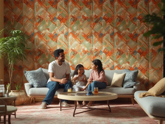
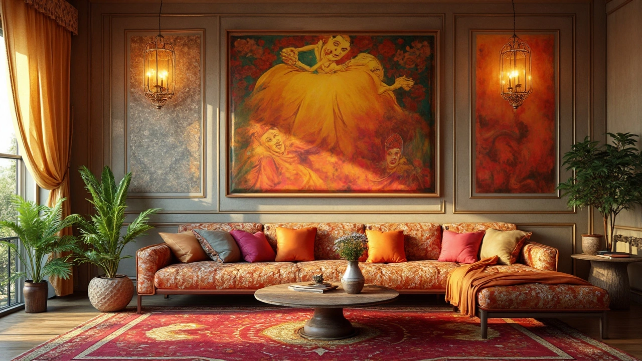
Beware of Busy Walls
Ever tried to hang a picture on a wall that's already got a zillion things going on? It can end up feeling like trying to find Waldo in a sea of chaos. One of the biggest rules to remember when it comes to wall art is that less is often more. When a wall is overloaded with patterns, like bold wallpaper or loud paint, your art can easily get lost in the noise.
Take a step back and think about how your art will interact with everything else around it. Will it complement or clash? For example, a detailed piece might lose its charm if it's trying to compete with a heavily patterned background.
Instead, consider isolating your artwork where it can truly shine. Sometimes, simplicity is key. Opt for a plain wall or a subtle color scheme that lets your piece pop. If you're feeling adventurous and really dig those busy backgrounds, just make sure your picture has enough contrast to stand on its own.
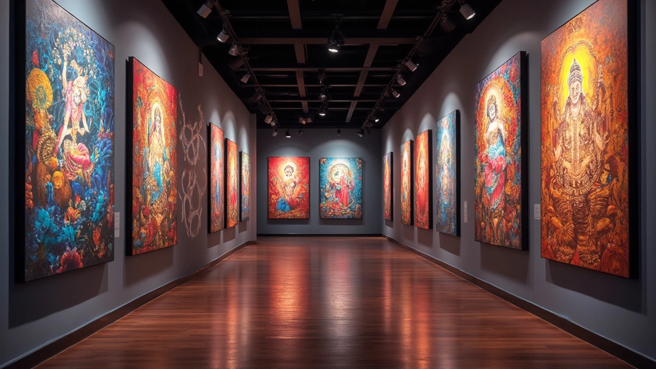
Spacing is just as crucial. Ever noticed how art galleries leave plenty of blank space around their art? That's so each piece can stand out for visitors. You can do the same at home. Try to leave some breathing room between each piece, so they don't fight for attention and can each tell their own story.
Finally, when dealing with a bustling wall, think about grouping strategies. A gallery wall could be the right move if you plan it thoughtfully. Instead of random placement, use an invisible grid to arrange your pieces for a cohesive look. Mixing sizes and frames can even look chic when done right.
Height: Too High or Too Low
Ever walked into a room and found yourself craning your neck to look at a picture? Or maybe doing a little squat to see it properly? That's probably because it's hung at the wrong height. Getting the height right isn't just about aesthetics; it's about comfort and making sure your wall art has the impact it's supposed to have.
So, what's the magic number? Most art pros agree that the center of your picture should be at eye level. Eye level for most folks falls around 57 to 60 inches from the floor. But hey, if you’re tall or hosting tall friends a lot, you might want to bump it up a bit.
But what about over furniture, like a couch? A good rule of thumb: keep the bottom edge of your art about 6 to 8 inches above the furniture. This keeps things close enough to look connected, without feeling cramped.
Let's keep it real—no one wants to be squinting at their favorite photograph or piece of art. So before you hammer that nail, grab a friend or a level to check the height. It’s easier to adjust before pounding that first nail than to deal with a dozen tiny holes later.
Room for Viewing and Movement
Ever found yourself in a house where the wall art feels more like an assault course than a gallery to admire? That's probably because nobody thought about giving proper room for viewing and movement. When you squeeze art into tight spots, it loses its magic.
Consider this: art needs breathing room. If people have to contort their bodies just to catch a glimpse, they’ll just skip it. According to interior design expert Susan Winton, "Art deserves the adoration it commands; give it the right space and it will elevate your environment."
Susan Winton, Interior Design Quarterly
So, what's the best tip here? Aim to hang your art where there's sufficient space for someone to step back and actually see it—think of it like setting up that perfect selfie shot where you want the background to complement you, not overwhelm or crowd you.
You also need to think about foot traffic. If everyone bumps into the art because it's not placed with enough clearance, it’s not only annoying, but you could also get damage from constant brushes and knocks.
Here's a quick list of tips to keep in mind:
- Leave at least a few feet of space in front of larger art pieces so viewers can step back and take it all in.
- Avoid placing art along busy walkways or narrow corridors—people focus more on moving than looking.
- Ensure the art is at eye level for the average person—usually, this means centering at about 57 to 60 inches from the floor.
So remember, you’re not just aligning holes in your wall. You’re crafting an experience. Making less-cluttered, well-planned spaces ensures that your artwork commands all the attention it deserves without competing with the chaos around it.