Picking a paint color for your living room can feel like a massive deal. You're not just choosing a color; you're kind of deciding how the room will feel every single day. Imagine walking into a space that just makes you grin—or, worse, one that drags your mood down. Colors do that to us, even if we don't always realize why.
There's a reason most people skip dark, gloomy shades in places where they want to feel alive and energized. But it's not just white walls or beige everything, either. Certain hues are proven—yep, actually studied—to lift spirits, encourage conversation, and help everyone chill out more easily. That's why you'll often see sunny living rooms painted soft yellows or zesty greens; it’s not an accident. Some designers swear by a pop of blue for its calm vibe, while others double down on warm earthy tones to get that homey, settled feeling.
You don't need to invest in fancy paint or a total makeover to try this out. Sometimes, just swapping out cushions or adding a bold rug can shift the whole mood. The trick is knowing what vibe you want—do you want to feel pumped up, focused, or just super relaxed in your living room? The answer basically points you toward your ideal color, and it doesn’t have to cost a fortune or turn into a weekend-long project.
- Why Colour Matters in Your Living Room
- Popular Colours for Positive Energy
- Understanding Colour Psychology
- Best Shades for Different Room Sizes
- Combining Colours Without Clashing
- Easy Tricks to Refresh Your Colour Scheme
Why Colour Matters in Your Living Room
Choosing the right colour in your living room isn’t just about making things look nice. It actually impacts how you feel and how people act when they’re in that space. Psychologists say that colour can influence our mood, focus, and even energy levels. Ever notice how a bright, fresh room just feels easier to hang out in? Or how heavy, dark colours can make you want to leave a room sooner? It’s not just your imagination.
Your living room is usually the main hangout spot. Family, friends, and sometimes even work meetings happen here. The colour you choose sets the whole tone. For example, soft greens and blues tend to help people relax. Yellow, on the other hand, gives off a cheerful vibe that makes chatting and laughing feel more natural. These aren't wild design theories—studies show that wall colour can change how long people want to stay in a room and even what they talk about.
It’s also practical. Lighter colours can make small rooms look bigger and more open, while deep tones can make large spaces feel cozier. The trick is picking something that works with your Furniture, the amount of natural light you get, and your own daily routine. You could have the fanciest couch on the planet, but the wrong colour on your walls can zap the energy right out of the space.
- Living room decor with the right colour helps balance style and comfort.
- Colour impacts everything from mood to how much time people spend in your home.
- Good colour choices can totally change a room’s vibe without much effort or money.
Popular Colours for Positive Energy
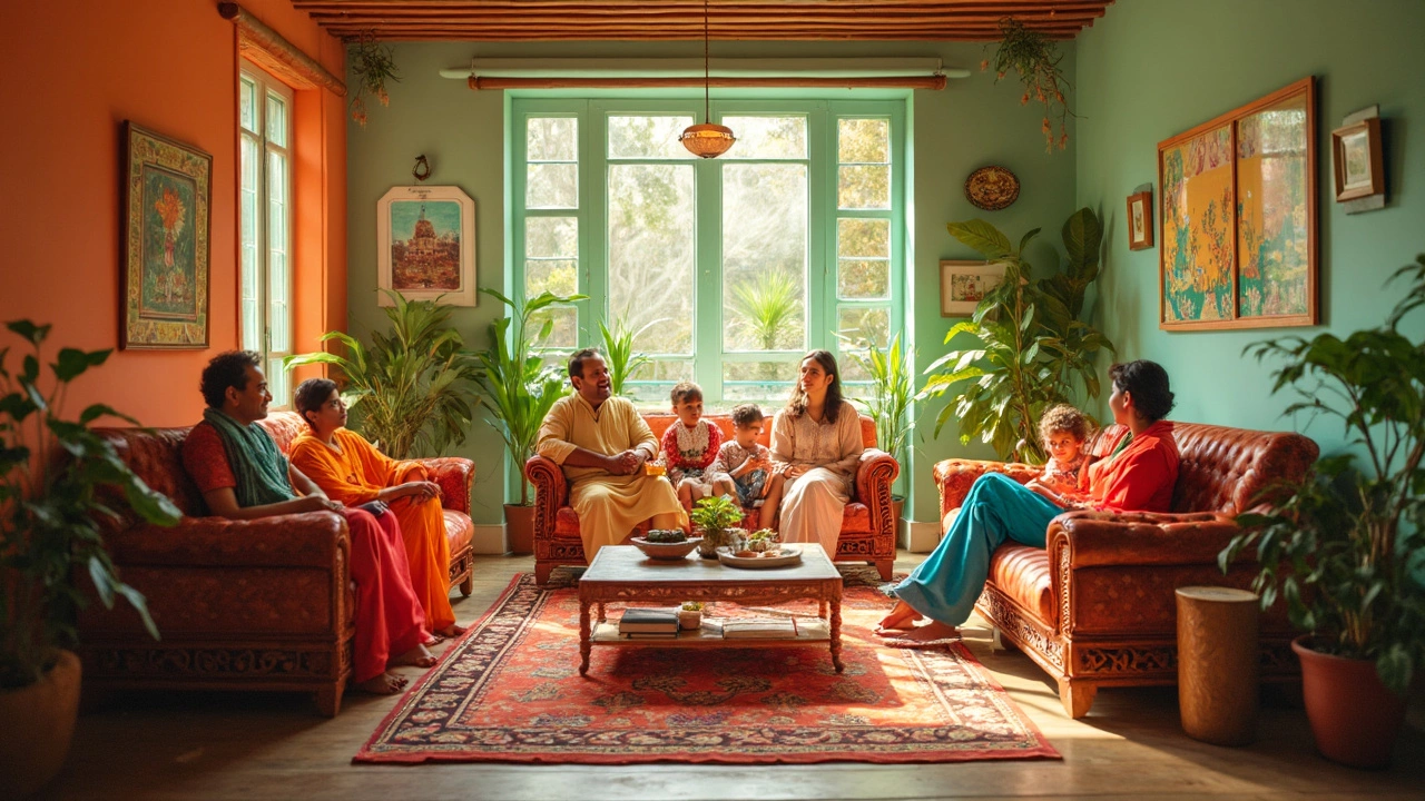
Not every color boosts the vibe in your living room, but a few stand-out shades seem wired to bring in good energy. Designers and psychologists have studied this stuff for years, and the results are actually pretty practical. Here’s a look at colors that get the job done if you want your space to feel more upbeat, comfortable, or just plain welcoming.
- Yellow: If there’s a king of positive energy, it’s yellow. Soft, buttery yellows or pastel lemon bring warmth and natural brightness. Studies link yellow with happiness and sociability—that’s why you’ll spot it in family rooms and kitchens too. But keep it subtle: bold, neon yellows can be a little too in-your-face and might get old fast.
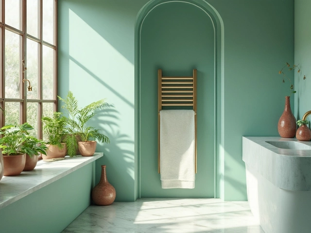
- Green: This one’s a go-to for balance. Green echoes nature and signals rest and calm. For living rooms, sage or olive greens are especially popular right now because they work with pretty much any style, from modern to farmhouse. Green also seems to help reduce eye fatigue, which is handy if you spend hours staring at screens nearby.
- Blue: When you need a calm, inviting atmosphere, blue comes out on top. Lighter shades like sky or powder blue promote relaxation and focus (one study from the University of Sussex even showed that blue can lower stress!). Blue’s versatile—pair it with almost any other color and you won’t go wrong.
- Peach or Coral: Not as bold as red, but warmer than beige, these shades blend energy with comfort. They reflect light and are easy to coordinate with other accent colors, especially for smaller rooms where you want a bit of a glow-up but nothing too intense.
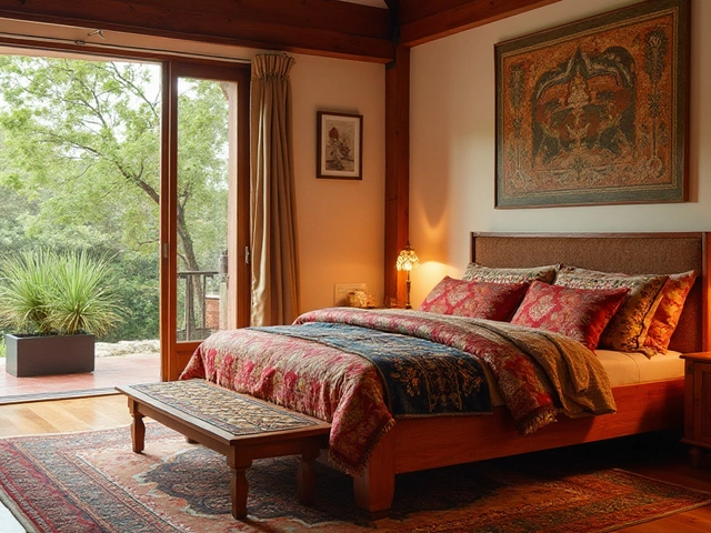
- Warm Earth Tones: Think sandy beige, terracotta, or soft taupe. These colors ground a living room and give off a cozy, steady feeling. People tend to feel safe and comfortable surrounded by earthy tones, which makes them classics for the main gathering spots in a home.
Whatever you pick, keep the finish in mind. Matte and eggshell paints soak up extra light, which can make bright colors look calmer. If you want something peppy, try a semi-gloss or satin finish to bounce more light around. Swatches are your best friend—sample a few on the wall and watch them in different lighting before you go all-in.
Understanding Colour Psychology
It’s wild how much your living room’s color can affect your mood, energy, and even your habits. The human brain reacts to colors without us even trying. Scientists have run tons of studies showing that certain shades can pump you up or help you slow down. That’s why the paint companies and interior designers talk about “mood” so much—there’s actual proof behind it.
Here’s what you need to know about some of the most common living room colors and how they influence how a space feels:
- Blue: Famous for its calming effect. Blue rooms make people feel chilled out and tend to lower stress. Lighter blues help a space look open and clean, while navy adds a classy vibe without feeling too cold.
- Yellow: Brings energy and brightness, almost like an instant mood-lifter. Research out of the University of Rochester points out that yellow can boost happiness and spark creativity. It’s great if you want your living room to feel lively.
- Green: Nature’s go-to. It’s balanced and restful, easy on the eyes, and doesn’t really go out of style. Green is linked to lower anxiety and helps with focus, which is handy if your living room does double duty for work or study.
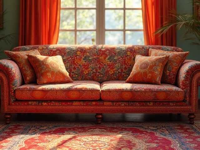
- Orange: Not for the faint-hearted, but it really pops when done right. Orange gives off warmth and can spark social vibes. Just keep it to accents or smaller walls unless you’re all-in.
- Earth Tones (like taupe, clay, or beige): These make things feel comfy and grounded. Experts say earth tones can help reduce restlessness and are perfect for a space where you want to just relax.
Check out some quick data on how people respond to popular living room colors. According to a recent survey done by Sherwin-Williams with 1,000 homeowners:
| Color | Most Common Feeling | % of People Reporting Positive Energy |
|---|---|---|
| Blue | Relaxed, calm | 68% |
| Yellow | Happy, energized | 59% |
| Green | Refreshed, focused | 55% |
| Beige/Earth tones | Comfortable, safe | 49% |
Keep in mind, the living room decor you pair with your color choice matters too. A cozy sofa and soft lighting will work with almost any shade to boost positive vibes. If you’re not sure where to start, sample a few patches on your wall and see not just how they look, but how they make you feel after a few days. Your gut’s a pretty solid guide when it comes to color psychology.

Best Shades for Different Room Sizes
The size of your living room isn't just about how many chairs you can squeeze in—it's a big deal when it comes to choosing color. Different shades can trick the eye, making a room seem bigger or cozier, depending on what you need. Here’s how to play it smart with color in rooms of any size.
If your living room is on the small side, lighter colors are your best friends. Light shades like soft whites, pale grays, or gentle pastels bounce natural light around the room. This makes everything seem brighter and more open. According to a 2023 survey by the National Association of Realtors, almost 60% of small apartment owners picked white or light beige for their main living space for exactly this reason.
Bigger living rooms can sometimes feel a bit ‘empty’ or cold if the walls are too pale. That’s when deeper, richer colors come into play. You can safely go for bold navy, emerald green, or even a burnt orange. These give the space a grounded, warm feel without making it seem cramped. Still, too much dark shade without enough lighting can make a large room feel gloomy, so mixing in lighter accents—like cushions, rugs, or wall art—works wonders.
Check out this table for a quick cheat sheet about what works for different room sizes and vibes:
| Room Size | Top Shade Picks | Effect on Space |
|---|---|---|
| Small | Soft white, light gray, blush pink, pastel green | Makes room look bigger and more open |
| Medium | Warm beige, sage green, pale blue | Balanced and comforting, with more personality |
| Large | Deep blue, terracotta, forest green, charcoal | Adds warmth and a cozy vibe without shrinking the room |
Don’t forget lighting. A small room with loads of natural sunlight can actually handle a more playful color, like a zesty yellow or mint green. For bigger rooms with not much sunlight, layering warm and bright accents stops the space from feeling too dark. Bottom line: work with your room, not against it, and you’ll get a living room decor that lifts everyone’s mood.
Combining Colours Without Clashing
Mixing different colors in your living room can make or break the space. If you’ve ever looked at a room and thought, 'Why does this feel so off?' it’s probably because the colors are fighting each other instead of working as a team. But getting it right isn’t rocket science—you just need a few simple tricks.
The smartest place to start is the color wheel. It’s not just for art class; it’s your friend when it comes to matching or contrasting shades. The big rule? Opposite colors on the wheel (like blue and orange) tend to pop against each other, adding energy, but if you prefer calm, pick neighbors on the wheel (like green and blue) for a smoother vibe. Interior designers usually stick to the 60-30-10 rule. Here’s how it works:
- 60% goes to your main color—think walls or a big sofa.
- 30% is for a secondary color—maybe a rug or curtains.
- 10% is an accent color—things like throw pillows or art.
Here’s a quick cheat sheet on safe combos that actually feel fresh:
- Soft grey + yellow + white
- Peach + teal + gold
- Beige + sage green + rust orange
If you’re worried about colors clashing, go with neutrals for your biggest items and toss in color with smaller, easy-to-swap things. That way, you’re not stuck if you want to change things up later. Want a shortcut? Find a patterned pillow or artwork you love—pull its colors for your room’s palette. Designers do this all the time because it just works.
Check out this simple table to spot some typical living room combos and how people rate their vibe:
| Color Combo | Room Vibe | People Who Like It (%) |
|---|---|---|
| Blue + White + Beige | Calming/Coastal | 61 |
| Green + Mustard + Grey | Fresh/Energizing | 48 |
| Charcoal + Blush + Brass | Modern/Warm | 39 |
Avoid putting too many bold shades together; two strong colors are usually enough. If one of your colors doesn’t feel right with the rest, swap it for a shade that's muted or lighter. A living room decor color palette only works when it feels easy on the eyes—so trust your gut before you commit!
Easy Tricks to Refresh Your Colour Scheme
You don’t have to repaint the whole place or drop big money on decor to give your living room a boost. In most cases, you can shake up the look and vibe of your space with some straightforward, wallet-friendly moves.
- Swap Cushion Covers: Get a couple of bold colored cushion covers. Just swapping out your pillow cases for ones in sunny yellow or soft emerald can instantly wake up a boring sofa.
- Change Your Rug: Pick a rug in a vibrant shade or fun pattern. Reds, blues, or even a deep green instantly create a “wow” factor and help tie the room together.
- Paint an Accent Wall: If you’re cool with a little work, painting just one wall in a punchy color (think terracotta or teal) is way less stressful—and gives your room that “designer” touch without overdoing it.
- Rotate Art and Photos: Sometimes, it’s just about what you hang up. Find prints or photos that have the living room decor colors you want to highlight—like yellows, light blues, or earthy reds.
- Plants and Greenery: Adding a couple of plants not only freshens the air, but brings lively shades of green—a color proven to boost relaxation. Even faux plants work if watering is not your thing.
- Throw Blankets and Accessories: Don’t underestimate cheap throws, candles, or vases in your color of choice. These small hits of color help a room feel pulled together and more positive.
And here’s something wild—according to a survey by the paint giant Dulux in 2023, about 61% of people said changing just a few color accents in their living room made them feel more upbeat at home.
| Change Made | Reported Mood Boost |
|---|---|
| New Cushion Covers | 46% |
| Accent Wall Paint | 58% |
| Add Plants | 41% |
| New Rug | 52% |
If you’ve got white or neutral walls, you’re in luck—these tricks pop even more. Mixing up these details every season is an easy way to keep things fresh and keep the energy in the room flowing.